
Below are the graphics and images that we see trotted out time and again to support various arguments in education. And all of those arguments, if based on these graphics as evidence, are most likely bad arguments. I’m not the first to point out how these have been debunked, and I’m sure I won’t be the last.
1. This cartoon as an argument against an academic curriculum: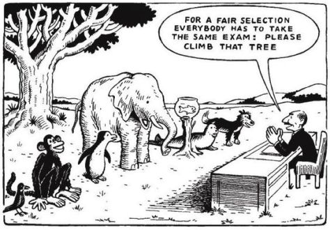

In an age where almost everyone in education is against the looming government policy of expanding the grammar school programme, there exists a cognitive dissonance whereby many of the same anti-selection advocates also embrace the idea that pupils should be assessed differently/be given a vocational education up to the age of 16 because ‘not every child is academic’. Michael Fordham skewers the argument for introducing a vocational education earlier far better than I can here, but suffice to say, this seems like just another form of academic selection to me. One of the other troubling things about this image is that it equates children with different classes of animal. I think that children have more in common with each other than they do differences, and certainly not differences of such extremes represented by this image. Of course, there will always be a minority of pupils who do have more extreme physical or educational needs, and we should meet those needs, but this doesn’t involve changing the approach to education for the majority of pupils and holding these pupils to different standards by shutting them off from an education they might later wish they’d had the opportunity to acquire.
And if you see the related quotation, ‘Everyone is a genius. But if you judge a fish by its ability to climb a tree, it will live its whole life believing that it is stupid.’ attributed to Albert Einstein, you might want to point out that they are misattributing it.
A good counter for this argument is – and this is something Einstein did actually say – a speech given to the State University of New York in 1931, ‘On Education’:
“I want to oppose the idea that the school has to teach directly that special knowledge and those accomplishments which one has to use later directly in life. The demands of life are much too manifold to let such a specialized training in school appear possible […] The school should always have as its aim that the young man leave it as a harmonious personality, not as a specialist. This in my opinion is true in a certain sense even for technical schools, whose students will devote themselves to a quite definite profession. The development of general ability for independent thinking and judgement should always be placed foremost, not the acquisition of special knowledge. If a person masters the fundamentals of his subject and has learned to think and work independently, he will surely find his way and besides will better be able to adapt himself to progress and changes than the person whose training principally consists in the acquiring the detailed knowledge.”
Oh, and all this is compounded by the fact that, if it weren’t for fish getting out of the sea and climbing trees, we probably wouldn’t have evolved to be here now, arguing about a silly cartoon. Good job fish! A* in that exam!
2. This graphic as an argument against teaching systematic synthetic phonics:

In fact, this is a good argument for teaching phonics. It shows that there are clear correspondences between graphemes and phonemes and it highlights that there are rules for these correspondences – rules which the graphic ignores. One of the rules, for example, is that gh is never pronounced ‘f’ at the beginning of a word. Likewise, we’d never pronounce the grapheme ti as ‘sh’ at the end of a word. So if you see someone using this as an argument that English isn’t a language that can be taught through phonics, tell them that it proves just the opposite. You just have to know the rules.
(And if they attribute the ghoti/fish idea to George Bernard Shaw, you can tell them that they are doubly wrong.)
3. This graphic as an argument against direct instruction:

Pyramids are like catnip to teachers. Present anything in a pyramid and we are sold. If you don’t believe me, put a Toblerone and a bar of Dairy Milk in the staffroom on Monday and see which gets finished first. This particular pyramid – often referred to as Dale’s cone – is made even more enticing as it has lovely numbers and abstract concepts spewed all over it. And it often has a nice citation of its source at the bottom: National Training Laboratories. Mmmm, laboratories. It’s all just so… sciencey. But it really isn’t.
Before I get on to provenance, the first thing one should notice is the numbers. Such perfectly rounded numbers going up in such neat increments. When was the last time you saw some research produce numbers like this?
Yes, Dale’s cone is pretty much made up. It began life as a simple idea from the American educator Edgar Dale in 1946, as an intuitive model of how different media effect us. This original model didn’t include any numbers, and Dale himself even warned people not to take the cone too seriously.
The numbers were later added by an employee of the Mobil oil company, in a (non-academic) article he had written.
And as for the National Training Laboratories? Well, when they were asked about its provenance, the reply came back that “we no any longer have – nor can we find – the original research that supports the numbers.” Harumph.
Don’t listen to anyone using this as evidence for anything. Well, anything other than evidence for how much we all love pyramids. And even then, I’d always go with a tray piled high with Ferrero Rocher instead.
4. This comparison as an argument for education reform:

This is often used to point out that the structures and rules of schools are wrong. The problem is that all institutions have structures and rules. Hospitals have dress codes and, the last time I was in one, I was glad the doctors didn’t defer any decision making to me. I trusted them with my health. And I was glad of the silence and order too. I was glad that they had set times for visiting hours and people didn’t wander in and out as they pleased. You know, like a prison.
You see, we could easily draw attention to similarities between all sorts of institutions based on these structures and rules. If you worked at the Magic Kingdom in Disney World, you’d find much of those lists above structuring the way the place is run. Are we suggesting there should be reform there? Unless you want chaos in the park, a lack of safety on the rides and the guy in the Mickey Mouse suit turning up to work drunk, then you are going to need those rules and structures strictly adhered to. Is Magic Kingdom like a prison? No. And neither are schools. Schools have many other things that prisons don’t have, such as gates that kids can walk out of once their relatively short day stuffed full of learning and wonder is over.
This is a daft argument and is not the basis for school reform. I’m happy to listen to arguments for school reform, but this isn’t it. This is an argument that the Texas sharpshooter fallacy is alive and well.
5. Contextless EEG images of brain activity to claim positive effects of an intervention or activity:


I don’t know much about neuroscience, and I’d never claim to. The thing is, neither do neuroscientists. Of course, they actually know staggering amounts about the brain, but what I really mean is that neuroscience is such a developing science that we (them, not me) are only just beginning to understand about the brain.
Unless these sorts of images above are being used by a neuroscientist, I’d be extremely skeptical of what that person is saying with them. As suggested on the excellent Neurobollocks blog here, these sorts of images need more than just a picture of two brains with different colours on them. EEGs can measure lots of different types of brain activity and unless they tell you what it is measuring, the image is pretty useless. What’s more, you’ll also need to know what the colours represent to understand what it is suggesting. I think these images largely play on our instinct that ‘more red is good’, whether it is or not. This is not to say that the original EEG didn’t have meaning. But if it is presented without this important information, that meaning is lost.
These sorts of images are mainly used to tell us that something (the thing someone is ‘selling’ us) makes our synapses ‘fire’. The problem here is that everything causes synaptic activity. Your synapses are firing reading this. But that doesn’t stop even top academics misunderstanding or misusing such images.
I’d steer clear of laypeople using these sorts of images to present an argument. Or at the very least, ask them a couple of questions. Ask them exactly what the images are representing: what particular brain activity is being measured and what the colours represent. And for further help, you could draw it to the attention of public skeptics of pseudo-neuroscience such as @neurobollocks.
By the way, the brain on the right in those images is actually an EEG of your brain when you read my blogs. I took the image through your webcam just now. Honest. Why would I lie to you?

Even though I thoroughly enjoyed reading this, is it totally pedantic and wrong of me to point out that a Toblerone is not a pyramid?
Ha! I promise you that I thought long and hard about it, but I’m sticking with it. You are right – the 2D triangles like the one presented above are just that: triangles. However, we tend to refer to them as (2D representations of) pyramids when used as graphics like this, for some reason. So I’m sticking with a Toblerone being a (nearly) 2D version of a pyramid.
No it is not pedantic at all.
A tower of Ferrero Rocher, on the other hand, is a beautiful pyramid full of delicious number sequences. If it weren’t for the fact that the hazelnuts would kill me, it’d be my favourite chocolate-based construction.
It’s always grated on me that they use the words “cone” and “pyramid” for triangles. Almost more so than the ridiculousness of the ideas presented in them.
What about the classification of things into arbitrary groupings. The seven types of intelligence, the five types of learner, the eleven types of classification styles.
#4 could be an argument for “The imposition of order in an institution that must work with large numbers of people is well-known to bring sanity and safety to an unmanageable and potentially harmful environment.”
I think the Growth Mindset image shown here was an early prototype drawing for Darth Sidius, but rejected as just too silly.
No 4 is often cited with a reference to Foucaults “Discipline and Punishment” (which includes hosptals, sctually…). The problem is that Foucaults analysis, one may like it or not, points to some techniques of modernity to build a certain kind of individuality, therfore it does not imply, in no way, that School IS a prison, but, as you pointed out, there are structural similarities between certain institutions.
The problem is that people actually use it to imply that school is a prison.
Indeed – that is a problem. Foucault’s claim of resemblance may not just be in terms of their physical attributes but also in terms of their function.
Reblogged this on The Echo Chamber.
Hi James,
Some thoughts on schools=prisons: https://sputniksteve.wordpress.com/2017/05/07/schools-prisons-and-foucault/
Also, I wrote about the Climb That Tree cartoon a little here: https://sputniksteve.wordpress.com/2016/12/28/climb-that-tree-differentiating-differentiation/
You had me at Toblerone. Great post, thanks!
One should be careful to differentiate between “vocational education” and “kinesthetic education”. The former is teaching people anything useful, (and which someone might be willing to pay them money to do). The later is teaching people how do something that involves moving some part of the body in some way.
Postponing all kinesthetic education until after someone turns 18 is a bad idea. It usually takes a long time to learn kinesthetic skills. Teaching needs to begin early.
Vocational education can wait until someone is about to be employed (or during an interim period of employment), but learning how to do useful things earlier is a great motivator of students. Most problem-based-learning is of this type.
I am specifically responding to how the image has been used to argue for a vocational education. You may very well have interpretations of the image, but I am responding to particular arguments that have been made time and again using it, hence the subheading. I also have never heard anyone suggest postponing kinaesthetic education until someone turns 18, least of all me.
Great post. For some reason all these fallacies keep being taught all over the world and especially, as far as I know, in American high schools.
What about the classification of things into arbitrary groupings. The seven types of intelligence, the five types of learner, the eleven types of classification styles. Those graphics are totally give a bed impression on our education system.